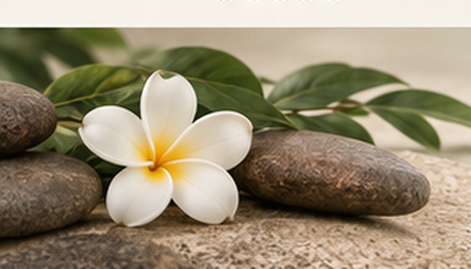
Comfortable to look at
The design uses softer contrast, rounded shapes and more visual breathing room.
Soft Feminine Wellness
An elegant wellness direction with a caring, feminine tone. Light, calm and emotionally warm — designed for massage, beauty, head spa and self-care rituals.
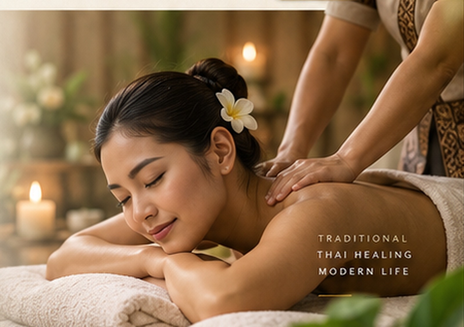
The design uses softer contrast, rounded shapes and more visual breathing room.
Beauty and wellness guests respond strongly to mood, softness and trust.
Pretty alone is not enough. The experience must also feel clear and calm.
Signature Treatments
Cards are softer, spacing is gentler and the visual language feels more nurturing — ideal for wellness and beauty-focused brands.
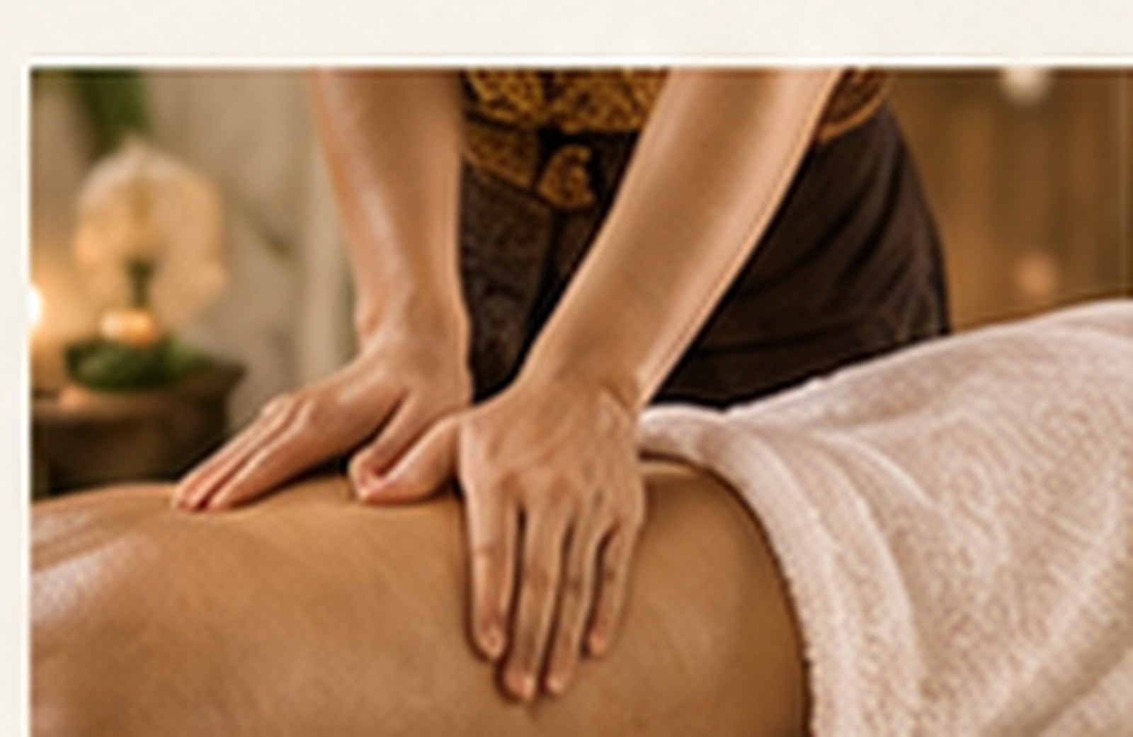
Relieve tension and reconnect with a lighter, more balanced body.
Learn more →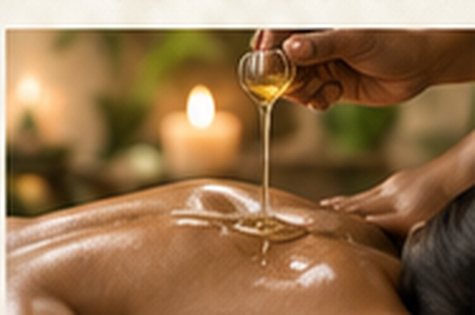
Our Story
This direction uses dusty rose, soft ivory, nude beige and champagne gold to create a feminine, warm and welcoming personality. It suits brands that want to feel nurturing, graceful and emotionally connected.
“Beauty and calm are not extras — they are part of the healing experience.”Discover the mood
A calmer digital experience
Rounded cards, delicate spacing, gentle type hierarchy and easy mobile reading support a calmer user journey from first impression to booking.

Replace with real review later.
“The atmosphere felt gentle and beautiful from the very first click.”Example quote placeholder
Book & Visit
This section can later be extended with Google Maps, real business hours and a final connected booking flow.